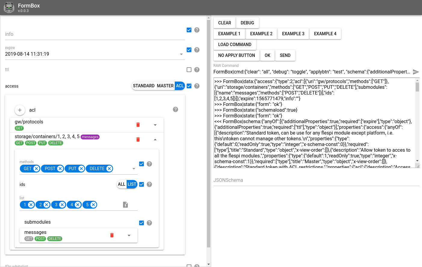
How to use FormBox
The idea of FormBox available at https://formbox.flespi.io/ is rather simple. (there is nothing at the link since this is not a standalone app)
FormBox can be used in two different ways:
1) as an iframe embedded on the web page
2) or in a separate browser tab/window.
If the latter option is chosen, the two windows will communicate using commands sent by JS via postMessage.
The web page calling FormBox should be subscribed to messages like this:
    window.addEventListener('message', function (event) {
      if (typeof event.data === 'string' && event.data.indexOf('FormBox|') === 0) {
        console.log(event.data)
        ...
      }
    })
Before sending commands you should wait for FormBox to report that it's ready to work:
FormBox|state:{"ready": true}Once this message is received, you can start managing the form.
Use the following syntax to send commands to FormBox opened in an iframe:
document.getElementById('form').contentWindow.postMessage('FormBox|cmd:...', '*')FormBox commands
To specify the schema for the form (build a form) you need the command of the following type:
FormBox|cmd:{"schema":{"additionalProperties":true,"description":"Send command with any parameters using connection to channel","title":"Send custom command","type":"object"}}This command will create a form filling the object with any random fields.
You can also specify the prepopulated data using the following command:
FormBox|cmd:{"data":{"testbool":true,"testint":123, "teststring": "some text"}}The result of this command will be three fields filled with specific values.
By default, as the form is filled out, all changes are instantly sent to the parent page that opened FormBox. If you want the form to send updates only on button click, activate it using the following command:
FormBox|cmd:{"applybtn":"send"}This will show the "send" button under the form (you can change button caption to any other text).
To disable the button use empty string:
FormBox|cmd:{"applybtn":""}You can enable debug mode to see what data is about to be sent:
FormBox|cmd:{"debug":true}And of course you can clear all the data:
FormBox|cmd:{"clear": "all"}All of the above can be done in a single command simply combining all objects in one config:
FormBox|cmd:{"clear": "all", "debug":true, "applybtn": "send", "schema":{"additionalProperties":true,"description":"Send command with any parameters using connection to channel","title":"Send custom command","type":"object"}, "data":{"testbool":true,"testint":123, "teststring": "some text"}}FormBox JSON Schema
FormBox uses the standard JSON schema format for form generation. Currently, approximately 70-80% of JSON Schema functionality has been implemented.
In addition, there are some additional parameters for customizing form display:
For any JSON Schema type you can use
x-view-hidden: true // hides control
x-view-hint: 'markdown text'
For boolean type you can choose between checkbox and toggle render (toggle - is default)
type: boolean
x-view-type: 'checkbox' // will be toggle if not set
For numbers you can specify custom renders like datetime for timestamp or kilobyte / kibibyte for storage size in kilobytes. Also you can specify units and placeholder text for input element.
type: number
x-view-type: 'datetime' // 'datetimezero' || 'slider' || 'kibibyte' || 'kilobyte' || 'seconds'
x-view-divider: 1000
x-view-placeholder: 'placeholder text'
x-view-unit: 'hours'
For string type you can select render type, hashing function and placeholder text
type: string
x-view-type: 'email' // 'password' ||  'textarea' || 'code'
x-view-autogrow: true // only for textarea
x-view-hash: 'sha512' // 'md5', only for x-view-type: password
x-view-placeholder: 'placeholder text'
For string and number types you can specify selector render buttontoggle or radio if you use enum. Also you can specify enum-labels
type: string, number
enum: [1,2,3]
x-view-enum-labels: ['one','two','three']
x-view-type: 'buttontoggle' // 'radio'
For any element with anyof you can specify selector render
anyof:[
    {type: 'string', title: 'String'}, {type: 'number', title:'Number'}
]
x-view-type: 'buttontoggle' // 'radio'
For array of objects you can specify witch field will be used when item collapsed
type: array
x-view-shrink-field: 'field_name' // only for array of objects
For objects you can specify parameter ordering:
type: object
x-view-order: ['prop_6', 'prop_3', 'prop_4'] // property list
There is also a special renderer for objects of the geofence type:
type: object
x-view-type: 'geofence'
Geofence example:
{
  "description": "Area enclosed by a closed path",
  "properties": {
    "name": {
      "description": "geofence name, can be optionally used in 'geofence' counter",
      "maxLength": 128,
      "type": "string"
    },
    "path": {
      "description": "Series of coordinates",
      "items": {
        "properties": {
          "lat": {
            "description": "Latitude in degrees, between -90 and +90 inclusive",
            "maximum": 90,
            "minimum": -90,
            "type": "number"
          },
          "lon": {
            "description": "Longitude in degrees, between -180 and +180 inclusive",
            "maximum": 180,
            "minimum": -180,
            "type": "number"
          }
        },
        "required": ["lat", "lon"],
        "title": "Coordinate",
        "type": "object"
      },
      "maxItems": 1024,
      "minItems": 3,
      "type": "array"
    },
    "type": {
      "default": "polygon",
      "description": "Closed path",
      "readOnly": true,
      "type": "string"
    }
  },
  "required": ["type", "path"],
  "title": "Polygon",
  "type": "object",
  "x-view-order": ["type", "name", "path"],
  "x-view-shrink-field": "name",
  "x-view-type": "geofence"
}
Sandbox
FormBox also has a handy sandbox where you can play around with the commands and see how they work: https://formbox.flespi.io/#/example
