The fleet management market has countless applications for visualizing GPS-equipped units on the map, optimizing routes, and building reports. Tableau is a slightly different animal. Tableau is one of the leading BI platforms with a distinctive and powerful graphical interface and an extensive list of possible data sources for in-depth data analysis, actionable insights, and better decision-making. However, importing telemetry data from the tracking devices was only possible via a database engine. Since flespi positions itself as a hub for telemetry data, we decided to enable Tableau to get device messages (and analytics intervals) directly from the flespi platform.
Tableau allows creating Web Data Connectors (WDC) to add custom data sources and extract data from any applications. Flespi team has developed the flespi-tableau-wdc WDC to fetch messages from any tracking device registered in the flespi platform (note that this is an open-source project on GitHub so you are welcome to branch it and tweak to your needs).
Note: since flespi unifies the parameter names for all supported device types, you do not have to worry about matching the specific protocol’s naming convention.
Getting the telemetry data in Tableau
To get the telemetry data from a tracking device registered in the flespi platform run Tableau, in the left-side Connect menu click More in the To a Server section and pick Web Data Connector option.
You’ll be prompted to enter the URL of the connector. Paste this one:
https://flespi-software.github.io/flespi-tableau-wdc/device-data/flespidata.html
Once you click Enter, a dialog will pop up.
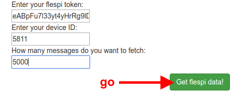
This is where you specify the following:
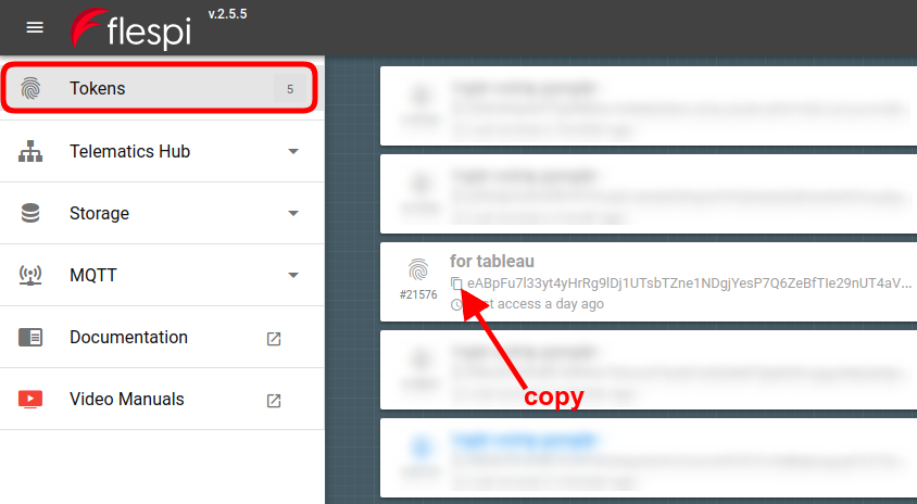
Token — your flespi token. If you used the flespi panel before, you already have one. Just make sure its TTL is long enough, click the copy icon, and paste the token to the top textbox:
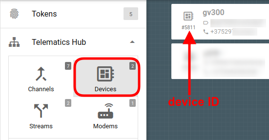
Device ID — the ID of the tracking device within the flespi platform (see how to create one). You can find it in the Devices menu:
Number of messages — how many last messages received by the tracking device you want to take into Tableau.
Click Get flespi data and the new table will be created in Tableau. Check that the data looks OK by clicking Update now:
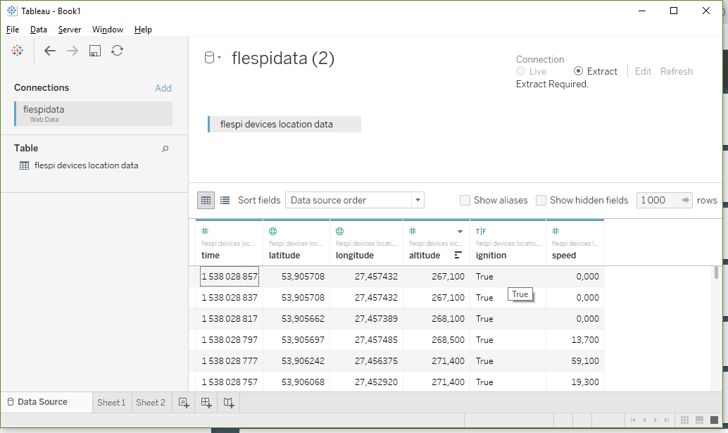
Yep, we do have the device messages in Tableau now! Now it’s all about working with Tableau to get the insights you need.
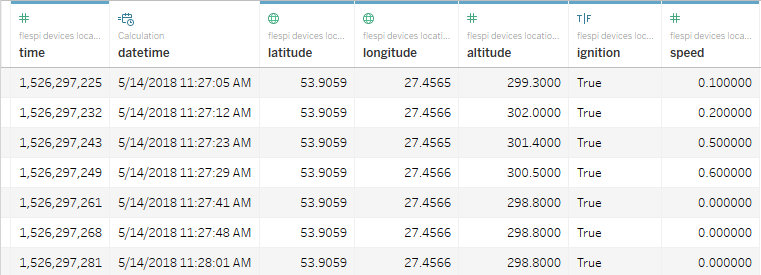
Note: currently the flespi-tableau-wdc WDC extracts latitude, longitude, altitude, speed, ignition status, and timestamp values from each message. The schema can be easily customized in the JS code to get other parameters.
Data preparation
Converting Unix time to human time
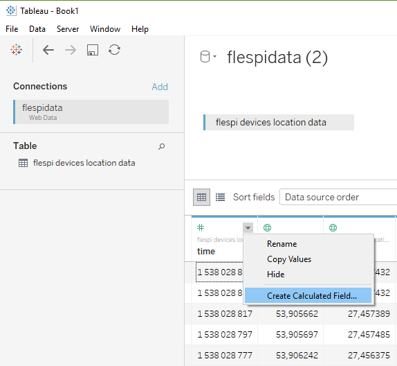
Flespi uses Unix timestamp to reflect when a message arrived. To convert a ten-digit value to a human date and time format add the calculated field (click the tiny arrow in the top right corner of the column header and select Create calculated field)
and enter the following formula for it:
DATEADD(‘second’,[time],#1970-01-01#)
You’ll get a new column with time and date for each device message:
Data visualization
Tableau is a flexible visualization engine after all. So, below are a few samples of what can be done with the telemetry data. The basic visualization entity in Tableau is a worksheet, so each of the below charts is a separate worksheet.
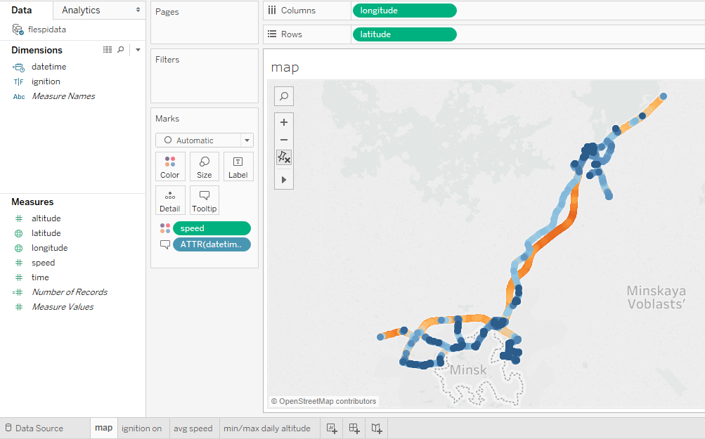
Map/Route
Since it’s location data, it’s probably a must-have. Just drag the latitude and longitude measures into the Columns and Rows fields and pick the symbol maps chart type. We also added the color scheme depending on the speed and the date and time value to the tooltip for each point on the map.
Daily average speed
For this one we used the highlight tables type of chart where the color of the cell reflects the scale of the value:
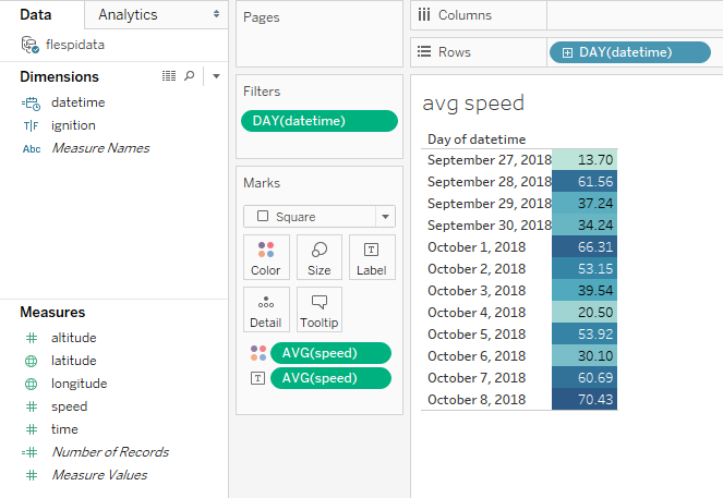
We also did the filtering to show the values for September and October only.
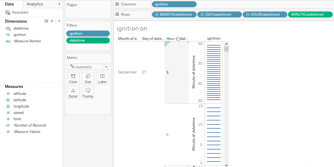
Ignition on/off over time
To display the intervals when the ignition of the vehicle was on we used the Gantt diagram detailed by the minute:
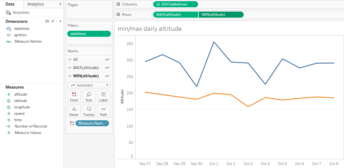
Min/max daily altitude
We also added a lines graph to show the minimum and maximum altitude values for the day. To do so we add the altitude to the Rows line twice and pick to calculate MIN for one and MAX for another. Then tick the Dual Axis for one of the measures to put them on the same scale. Then right-click on the altitude axis and select Syncronize Axis.
Composing a dashboard
Now we have four worksheets and will group them on a single dashboard for convenience.
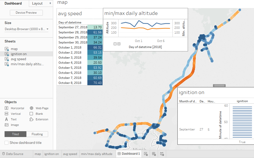
Note: If you make any changes to any of the worksheets, the changes will automatically reflect on the dashboard.
***
Tableau is all about diverse visual representations, easy filtering, and convenient views for the analysis. The flespi-tableau-wdc connector makes it possible to apply these vast capabilities to the telemetry data. Explore the new ways of aggregating data from GPS trackers and get a better understanding of the situation with hundreds of visualization, statistical, and analytical options.
UPD: Note that now our connector can also extract calculated intervals from the analytics engine for visualization in Tableau.
P.S. If you have a real-life scenario in mind that you would love to make viable in Tableau, send us a request and we’ll consider implementing it in our connector.