We’ve already shown you how to visualize telemetry data from flespi devices in Tableau. Now that we have flespi analytics generating intervals based on the user-defined criteria, we thought it would be nice to plot them nicely in Tableau as well. So we’ve expanded the possibilities of our flespi Tableau WDC to deal with the results of flespi analytics.
In this article we will:
create a calculator to detect stops, collect their duration, time, and location
visualize these stops on the Tableau map
find the average stop duration by location
calculate the number of stops in each location by day
Intervals calculation in flespi is device-based, therefore, you need to have at least one registered flespi device to apply calculations to its messages. Then we can move on to creating the logic for intervals extraction.
Calculator creation
The instance preoccupied with intervals splitting and subsequent intervals calculations is called a calculator.
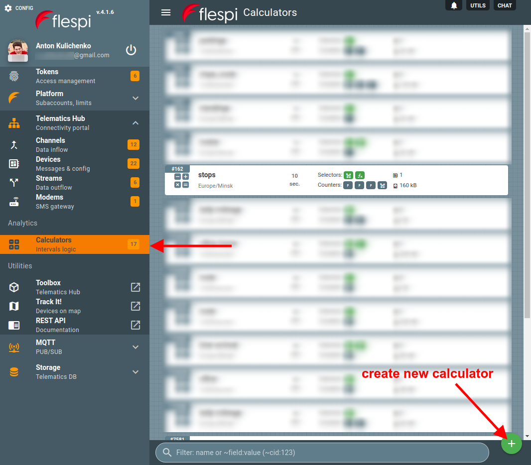
Below I create a calculator ‘stops’, add interval selectors to catch intervals when the moving speed is less than 5kph and the unit is within one of three geofences (home, office, and commute), and fetch the following information for each interval: time, latitude, longitude, duration, and location (attributed to one of the three geofences I mentioned above).
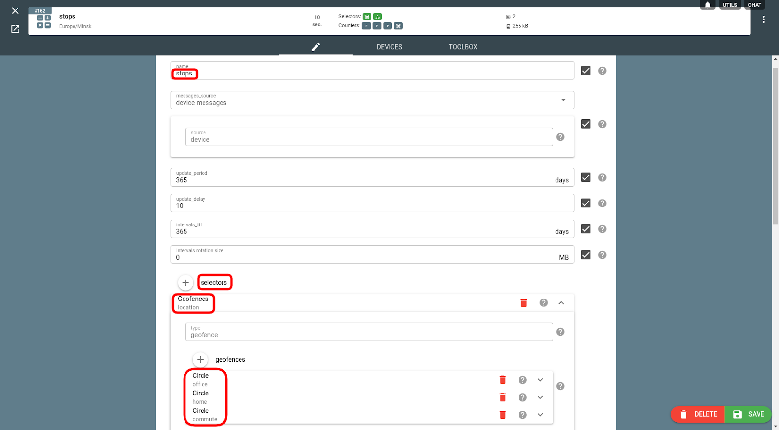
Speed condition is specified in the Expression selector like this:
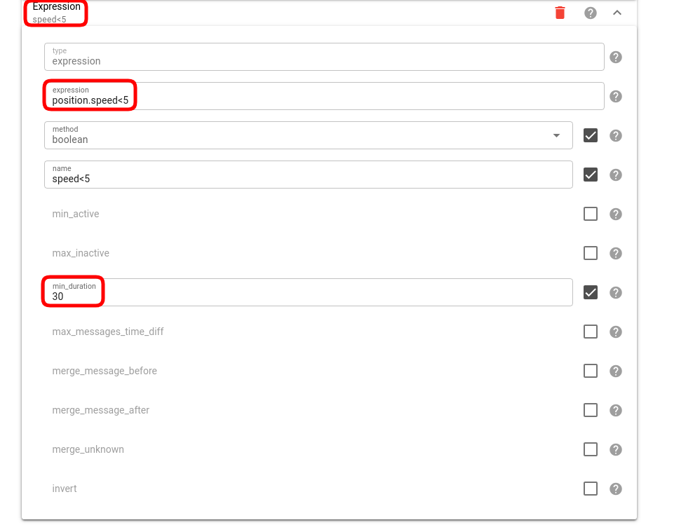
The counters for parameters we want to extract look like this:
You can use the following curl to create the above calculator:
curl -X POST --header 'Content-Type: application/json' --header 'Accept: application/json' --header 'Authorization: FlespiToken XXXXXXXXXXXXXXX -d '[{"counters": [{"method": "first","name": "position.latitude","type": "parameter"},{"method": "first","name": "position.longitude","type": "parameter"},{"method": "first","name": "time","parameter": "timestamp","type": "parameter"},{"name": "location","type": "geofence"}],"intervals_rotate": 0,"intervals_ttl": 31536000,"messages_source": {"source": "device"},"name": "stops","selectors": [{"geofences": [{"center": {"lat": 53.905804,"lon": 27.456803},"name": "office","radius": 1,"type": "circle"},{"center": {"lat": 53.926802,"lon": 27.607639},"name": "home","radius": 1,"type": "circle"},{"center": {"lat": 53.916565,"lon": 27.53499},"name": "commute","radius": 4,"type": "circle"}],"name": "location","type": "geofence"},{"expression": "position.speed<5","method": "boolean","min_duration": 30,"name": "speed<5","type": "expression"}],"timezone": "Europe/Minsk","update_delay": 10,"update_period": 31536000,"validate_interval": "","validate_message": ""}]' 'https://flespi.io/gw/calcs?fields=id'Note: replace the XXXXXXXXXXXXXXX above with the valid flespi token.
Intervals calculation
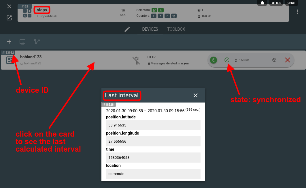
To calculate the intervals based on the above calculator configuration you need to assign the calculator to the specific device:
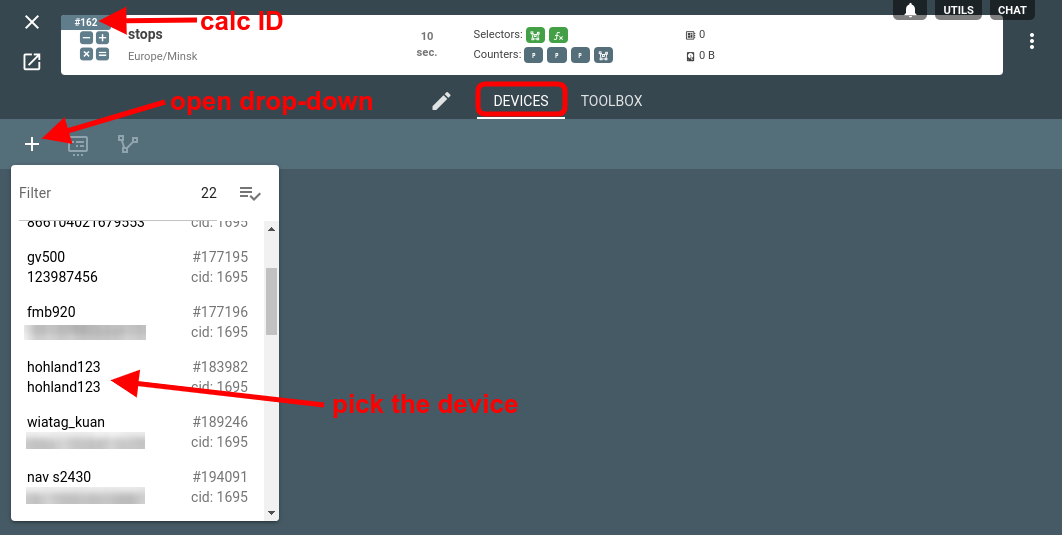
Once assigned, the calculation will be performed on the device messages and you will end up with something like this:
That’s all on the flespi side. Let’s switch to Tableau now.
Tableau WDC Connector
To get the data from flespi into Tableau, you need to run a special Web Data Connector (that we’ve made for you).
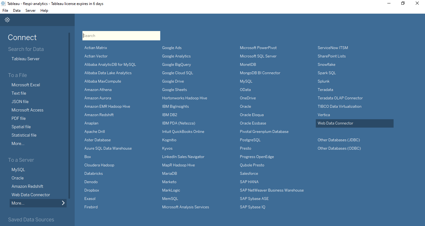
When on the Tableau start page, navigate to More… item in the To a Server section and pick Web Data Connector option:
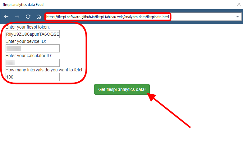
You’ll then be prompted to specify the URL to the WDC, which in our case is:
https://flespi-software.github.io/flespi-tableau-wdc/analytics-data/flespidata.html
When the flespi-tableau-wdc loads, you’ll need to enter a valid flespi token, the device ID and the calc ID earlier created in flespi (see screenshots above), and the number of intervals you want to fetch:
When you click Get flespi analytics data button, you will see the screen similar to this:
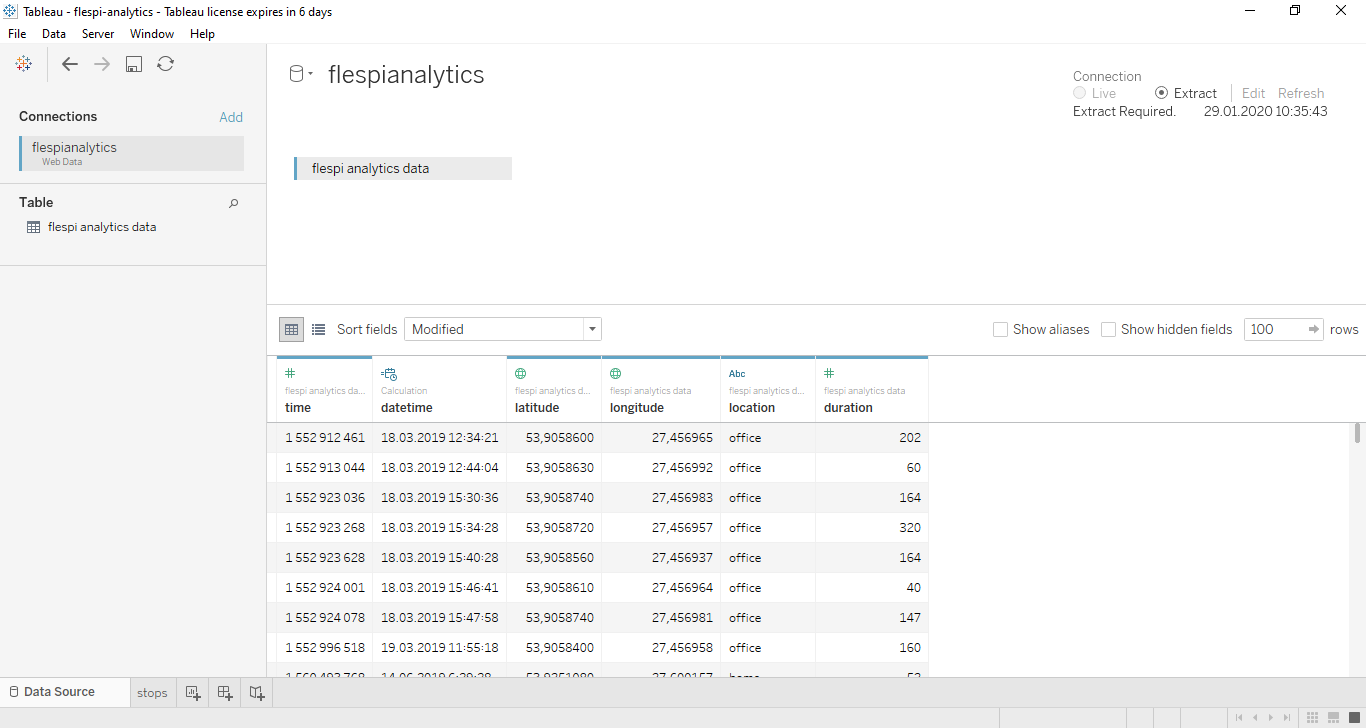
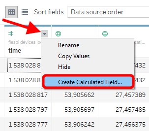
The only difference will be the datetime column (which is the UNIX timestamp converted into the human-readable time and date) that is not present in the original dataset but that you should add manually. To do so, click on the tiny arrow in the top right corner of the time column and select the Create Calculated Field… item:
Then put the following expression into the opened dialog:
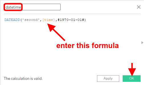
The new column will appear.
Visualizing flespi analytics data in Tableau
Now that we see all our telemetry parameters in the Tableau interface, we can do some nice things with them.
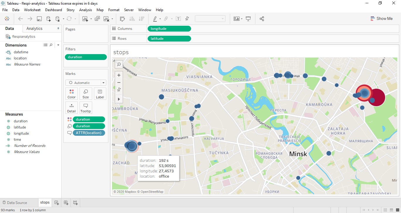
The first thing we did is visualized all the stops from the dataset based on their latitude/longitude, colored them depending on their duration (from dark blue for short stops to dark red for the long ones), and made the circle size dependant on the stop duration. The tooltip for each stop also includes the geofence (location) it belongs to.
This is the viz we end up with:
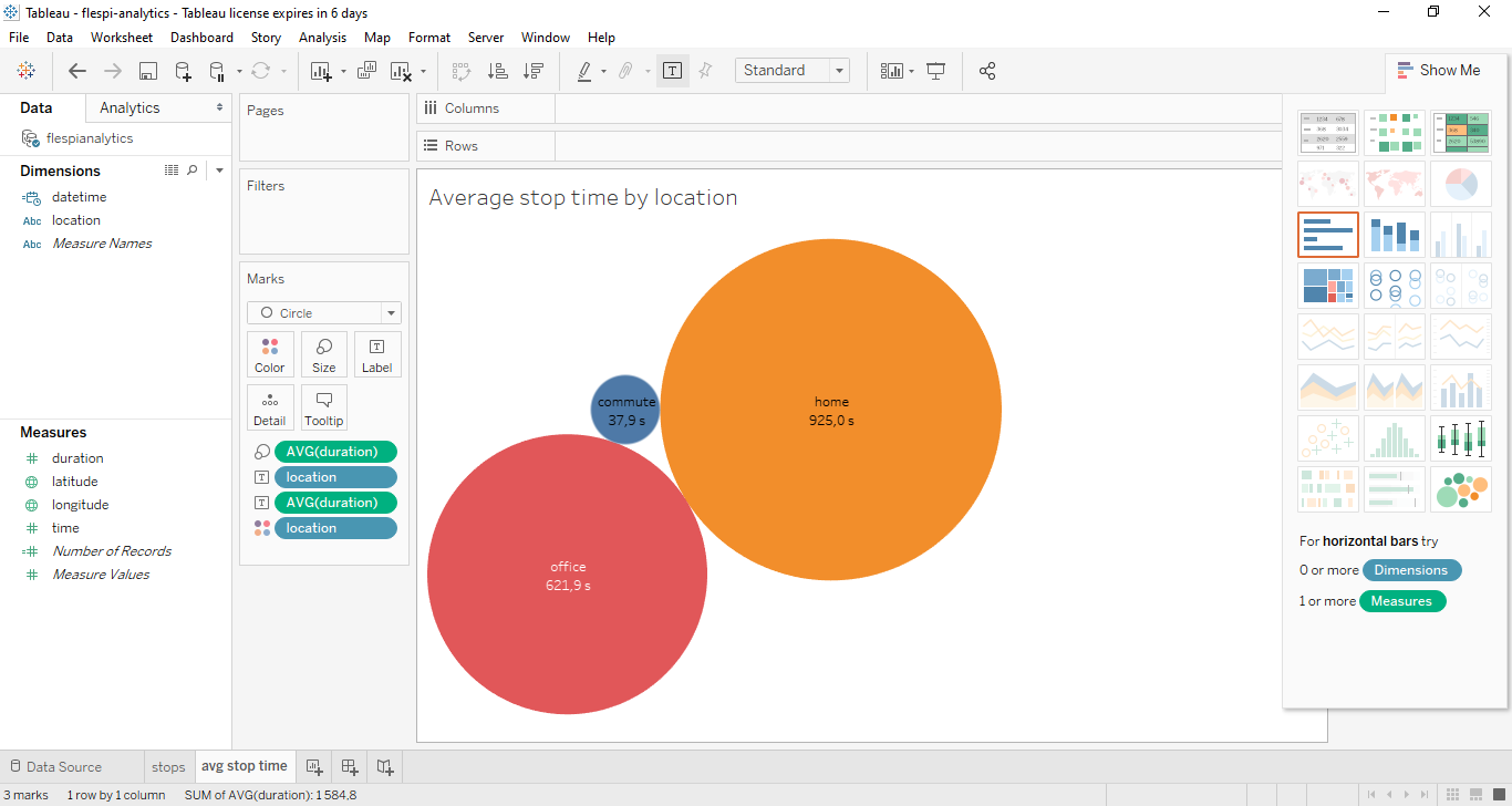
The next we did is simply calculated the average stop duration in each of the three geofences (home, office, commute) and displayed them in the bubbles of the proportional size:
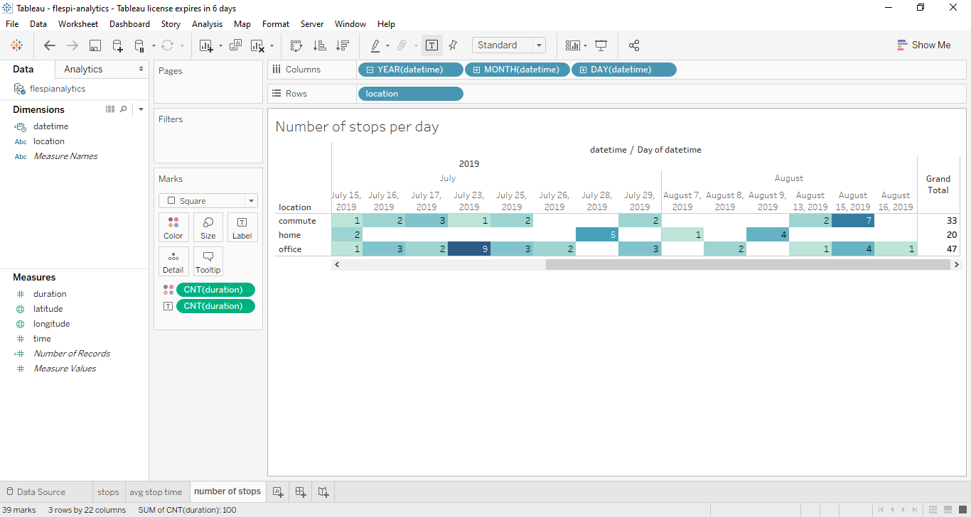
And lastly, we put together a highlight table summarizing the number of stops in each day for each geofence. The cell color also reflects the number of stops — the darker the color the bigger the number.
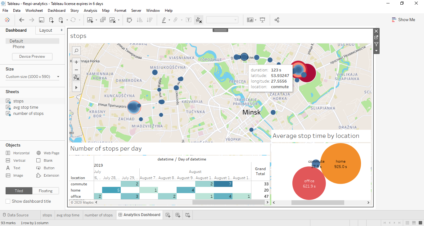
As the final step, we organized all the vizes on a single dashboard that you can then share with the interested parties.
***
That was just a basic demonstration of what you can do with aggregated telemetry data in Tableau. The focus of this article was on illustrating how intervals data from flespi analytics easily get in Tableau via the flespi-tableau-wdc connector and how they can be manipulated in a variety of ways. The visualization possibilities Tableau offers are vast and will greatly depend on your specific tasks. So install Tableau trial version and test it for yourself for 14 days.